


Restaurant Website
Redesign for Online
Ordering

A basic menu site was frustrating customers
and limiting online orders. I redesigned it
into a mobile-friendly experience with clear
categories, strong visuals, and a streamlined
ordering flow to improve usability, reduce
friction, and increase completed orders.
Project Overview
A Fish Named Taco is a Southern California restaurant specializing in bold,
coastal-inspired cuisine. I redesigned the digital experience to improve
accessibility, strengthen the brand's visual identity, and simplify the online
ordering journey.
The redesign focused on creating a more consistent interface, improving
content hierarchy, and guiding customers from menu discovery to checkout
with fewer points of friction.
The Challenge
The existing website lacked the visual hierarchy and usability needed to support a
modern restaurant experience.
Small typography, inconsistent spacing, low-contrast text, and an unclear navigation
structure made important content difficult to find and read. The ordering experience
also felt disconnected from the main website, creating additional friction for customers
trying to place an order.
Design Approach
The design prioritizes warmth, personality, and ease
of use. Bold typography, vibrant food imagery, and
playful visual elements create an inviting experience
that reflects the restaurant's character. Content and
interactions are structured to help users explore the
menu, discover featured dishes, and move naturally
toward placing an order.


Clear content hierarchy makes menu items
and ordering options easy to explore
Warm colors and expressive visuals create an
inviting, appetite-driven experience
Purposeful interactions guide users from discovery
to ordering without unnecessary friction
Bold typography and vibrant imagery capture the
restaurant's playful personality
User Mindset
Users visiting a restaurant website are often hungry,
curious, and ready to make a quick decision. The
experience must make it easy to explore menu options,
understand what makes each dish appealing, and move
toward ordering without hesitation. Content is structured
to feel visually engaging and easy to scan, using clear
hierarchy, appetizing imagery, and focused interactions
that support fast, confident choices.
Visual presentation and clear menu details
influence food choices
Confusing navigation or ordering friction
can quickly lead to abandonment
Users are often hungry and looking to make a
quick dining decision

Component System
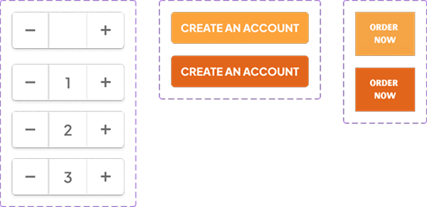
A modular component system was developed to
create a consistent and flexible experience across
the menu and ordering flow. Reusable components
and defined interaction states streamline design
iteration, maintain visual consistency, and create
predictable behaviors as users explore dishes and
move toward placing an order.
Uses predictable component states to simplify
menu exploration
Supports scalability as new dishes and menu
categories are added
Speeds up design iteration and prepares components
for development handoff
Maintains consistency across menu items and
ordering interactions
Key Design Principles
The Mobile Experience
The mobile experience adapts the desktop design into a focused, scroll-friendly layout
that makes menu exploration and ordering feel effortless. Clear hierarchy, responsive
components, and touch-friendly interactions preserve the restaurant's playful visual
identity while creating a seamless experience on smaller screens.


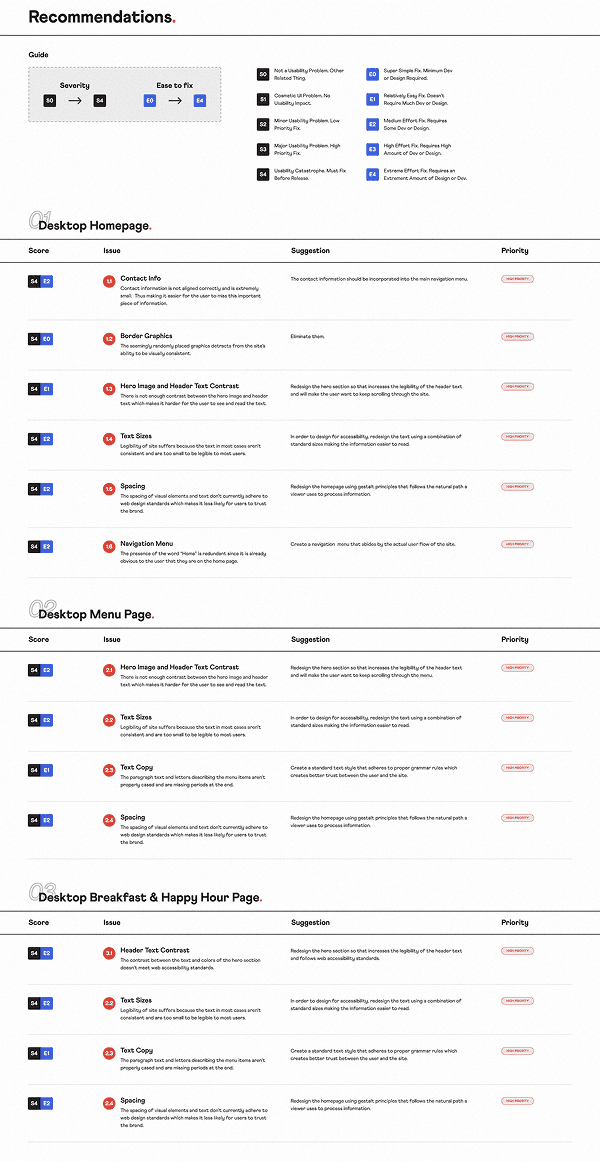
UX Audit/ Findings
I began by evaluating the existing desktop experience to identify usability,
accessibility, and visual consistency issues.
The audit revealed recurring problems with text legibility, spacing, contrast,
navigation, and content structure. Each issue was documented and mapped
to the specific area of the interface where users could experience friction.

Recommendations
I translated the audit findings into prioritized design recommendations
based on severity and implementation effort.
High-impact usability issues were addressed first, including text contrast,
typography, spacing, and navigation. This framework helped establish a
clear redesign strategy while balancing user needs with realistic design
and development effort.
Brand Direction
I refined the brand palette to create a vibrant visual system inspired
by the restaurant's coastal identity.
Turquoise became the primary brand color, while warm orange and
yellow accents were used to highlight actions, promotions, and
rewards. Deep navy provides contrast and improves legibility
across the interface.
bright colors to build trust
warm accent colors to add balance
consistent color tokens
High-contrast accessibility

Typography & Paragraph System
Bold display styles reinforce the restaurant's energetic personality,
while structured headings, labels, and supporting text establish
consistency. Type sizes and weights were selected to improve
readability and create stronger visual hierarchy.
I created a clear typographic hierarchy to make content easier to
scan across the website and ordering experience. Paragraph styles
were standardized to improve readability and maintain consistent
content rhythm throughout the experience.
single type family
clear visual hierarchy
consistent line heights
Optimized for Product UI


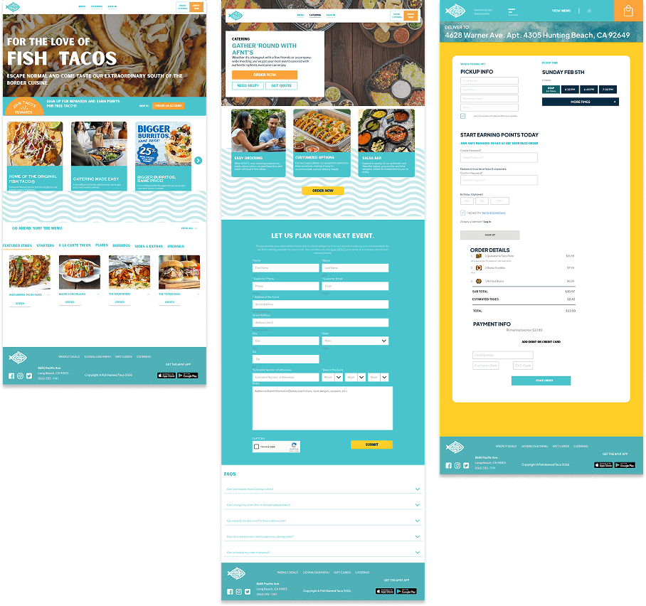
Key Screens
Core pages were designed to improve the online ordering
process, better menu browsing, improved incentives, catering,
a faster checkout process, and a streamlined way to
create an account.
Outcomes & Impact
The redesigned experience presents A Fish Named
Taco as vibrant, approachable, and memorable.
Clear menu structure, bold typography, appetizing
visuals, and purposeful interactions make it easier
for users to explore dishes, understand their options,
and move naturally from discovery to ordering.
Simplified menu exploration through clear
structure and interactive components
Faster decision-making with visually engaging
food presentation
Reduced friction throughout the pickup ordering
experience
Stronger brand recognition through a cohesive
and playful visual identity


Reflection & Next Steps
Reflection
Next Steps
The redesigned experience presents A Fish Named
Taco as vibrant, approachable, and memorable.
Clear menu structure, bold typography, appetizing
visuals, and purposeful interactions make it easier
for users to explore dishes, understand their options,
and move naturally from discovery to ordering.

Performance Monitoring: Tracking menu
engagement and ordering behavior to identify
where users interact, hesitate, or abandon the
pickup flow.
Ordering Optimization: Refining menu card '
interactions and the pickup experience to further
reduce friction from dish discovery to order confirmation.
Expanding the Experience: Scaling the component system
to support seasonal dishes, menu updates, and future
ordering features while preserving a consistent brand
experience.


