Thanks for reading!

This project highlighted the importance of balancing the professional credibility expected from a real estate company with the warmth and approachability of a residential experience. By combining structured content, reusable components, responsive layouts, and a distinct visual system, the redesign demonstrates how a real estate website can build trust while making property discovery and communication easier.
Next Steps:
- Usability Testing: Testing property discovery, service navigation, and contact pathways with prospective residents to identify areas of friction.
- Accessibility Review: Evaluating key experiences against WCAG 2.2 and refining keyboard navigation, screen-reader support, contrast, and interaction states.
- Expanding the Experience: Scaling the design system to support additional property listings, availability information, applications, and future resident-focused features.
Reflection & Next Steps
The redesigned experience gives Obsidian Realty a more professional, approachable, and cohesive digital
presence. Clear service pathways, structured property content, responsive layouts, and a consistent
visual system make it easier for prospective residents to understand the company, explore its offerings,
and get in touch.
Key Outcomes:
- Simplified property and service discovery through clearer information hierarchy
- Created more direct pathways for prospective residents to contact the company
- Established a cohesive visual identity across key website experiences
- Extended the experience across desktop and mobile with consistent responsive patterns
Outcomes & Impact
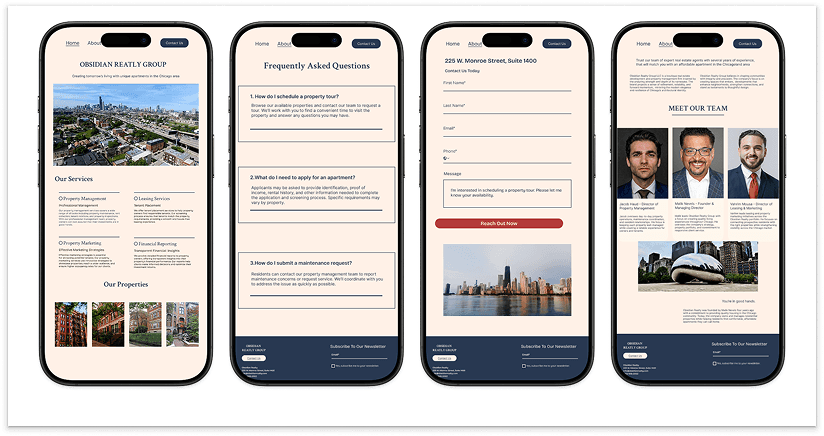
Each desktop experience was adapted for a 402 × 874 mobile viewport, with layouts, content,
and interactions optimized for smaller screens. Clear hierarchy and consistent design
patterns preserve the Obsidian Realty experience across devices.
Mobile Screens

The core screens connect property discovery, company information, common questions,
and direct communication within one cohesive experience. Consistent navigation, clear
hierarchy, and focused calls to action help visitors move naturally throughout the website.
Key Screens

Reusable components create a consistent experience across navigation, forms, and key interactions.
Defined states and shared patterns make actions easier to recognize while maintaining visual consistency
throughout the website.
Componenets For Clarity
Bricolage Grotesque creates a modern, confident typographic identity across the experience.
Structured heading and paragraph scales establish clear hierarchy and maintain consistent
readability across content, interface elements, and responsive layouts.

Typography & Paragraph System

The visual identity balances trust and professionalism with a warm, residential feel. Deep blues
establish stability, warm peach tones create an inviting foundation, and green accents inspired
by foliage within the property imagery connect the digital experience to the environments
Obsidian Realty represents.
Brand Direction

The site structure was organized around Obsidian Realty’s core services, properties, company
information, FAQs, and contact experience. Clear navigation and focused content pathways
help visitors move naturally from learning about the company to exploring services and getting
in touch.
Information Architecture
I focused on creating a clear, approachable experience that balances property discovery with
Obsidian Realty’s management and leasing services. A structured content hierarchy, reusable
components, and responsive layouts create consistency across each page while maintaining a
distinct visual identity.
Design Approach
Obsidian Realty needed a stronger digital presence that could communicate its property management
and leasing services while building trust with prospective residents. The challenge was organizing
multiple services, properties, and contact pathways into a clear experience that remained consistent
across desktop and mobile.
The Challenge
Obsidian Realty needed a digital experience that reflected its approach to residential real estate
while making property information and services easy to navigate. I designed a responsive website
that brings together property management, leasing, property discovery, and direct client communication
within a consistent visual system.
Project Overview
Real Estate Web Design For Property Management
Next Project
