Fitness Studio Website
Rebuild & Launch
The Problem: The Original UI
Outcomes & Impact


The redesigned experience improved clarity, reduced friction, and streamlined the
booking process, resulting in increased engagement, stronger user confidence,
and measurable growth in traffic and bookings.
Reduced friction across the entire booking journey

Strengthened brand credibility through a cohesive visual system
Increased user trust with clear hierarchy and actionable CTAs
Improved mobile usability aligned with real user behavior
Established a consistent and professional brand identity
Booking Experience
The booking experience was designed as a seamless end-to-end flow, guiding users
from login to confirmation with minimal friction while supporting both new and
returning users.

Component System
A scalable component system was created to ensure consistency, reduce design
friction, and enable faster iteration across key user flows.

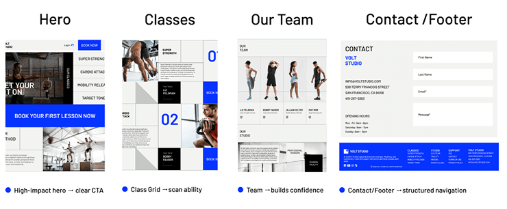
Landing Page
A structured landing page system designed to improve navigation, highlight key
fitness offerings, and guide users toward booking classes through clear hierarchy,
modular layouts, and conversion-focused CTAs.
Overview
The Original Design: Lacking Structure & Professionalism
Volt Studio’s website was left incomplete, lacking both structure and functionality. I
rebuilt the experience from the ground up, introducing a seamless booking flow
and a cohesive design system. The redesigned platform elevated the brand and
drove measurable increases in traffic and client bookings.
Before Volt Studio, the site relied on an outdated layout with inconsistent spacing,
unclear hierarchy, and no booking flow. The visual identity didn’t reflect the brand’s
energy, and the site lacked essential functionality for class scheduling and
membership management.
Typography and paragraphs were designed to create clarity and structure across the experience, ensuring
users can quickly scan content, understand hierarchy, and navigate key actions with minimal effort.

Improved readability through consistent spacing
Unified type system for visual consistency
Optimized for fast scanning and usability
Clear hierarchy for better content structure
Ensures high-contrast accessibility
Maintains consistent UI tokens
Drives action and engagement
Balances clarity and readability
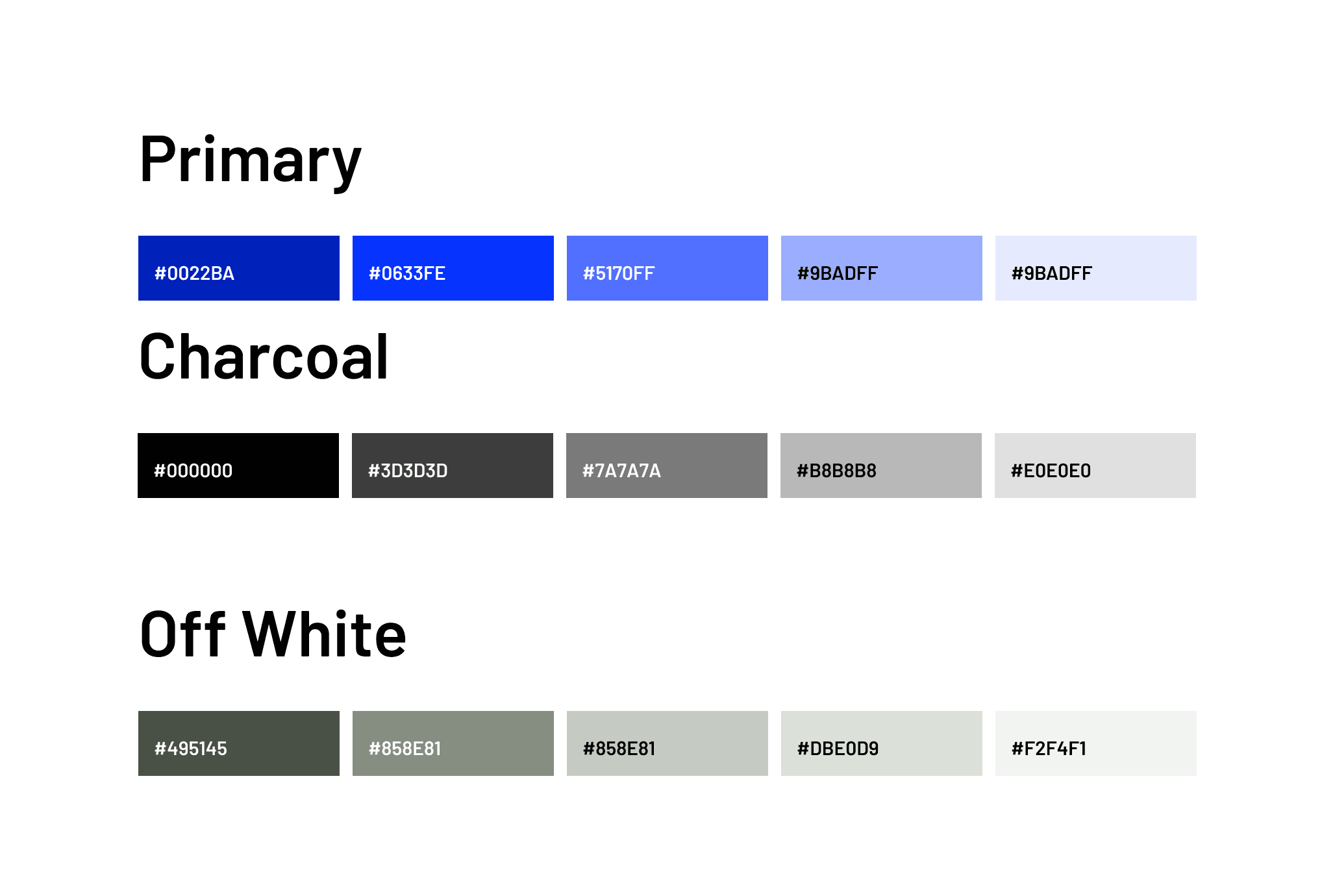
Brand Direction
The visual direction was built to reflect Volt Studio’s energy while maintaining clarity and
usability. A bold blue palette drives action and engagement, balanced by neutral tones
to support readability and visual hierarchy across the interface.
User Research
Information Architecture
UI & Visual Design
Design Systems
Prototyping
Skills

Modernize Volt Studio’s brand identity
Reduce friction during account creation
Create a seamless class-booking flow
Deliver responsive, modular layouts
Improve clarity for first-time guests vs. members
Build a scalable design system
Reduce friction during account creation
Goals
No clear navigation
Inconsistent typography
Missing brand identity
No booking system
Poor visual hierarchy

Call Outs

The schedule system prioritizes scannability and efficiency, helping users quickly
identify classes, understand key details, and take action without unnecessary
complexity.
Instructor visibility builds trust and confidence
Streamlined booking flow for members and guests
Key details surfaced for quick understanding
Designed for fast scanning and action
Clear weekly view with a responsive 7-day grid
Class Schedule

Larger fields improve accessibility and usability
Clear spacing enhances readability
Logical grouping improves form structure
Includes consent for trust and transparency
Focuses on essential inputs to reduce friction
Consistent label spacing enhances readability
The account creation flow was designed to balance completeness and usability,
ensuring users can quickly provide essential information while minimizing
friction and confusion.
Account Creation Experience

Class Registration Experience
The confirmation experience reinforces user confidence by clearly summarizing booking
details and providing a single, focused next action. Designed to eliminate uncertainty,
the confirmation screen presents key booking details upfront while guiding users t
oward a clear next step.
Clear summary of booking details
Key information surfaced at a glance
Highlights specialized class types
Single CTA keeps focus on completion
Clear next step reinforces success
Surfaces critical information for quick validation
Clear summary of booking details
Key information surfaced at a glance
Highlights specialized class types
Single CTA keeps focus on completion
Clear next step reinforces success
Surfaces critical information for quick validation

Account Dashboard
The dashboard was designed to keep users engaged beyond booking, providing
personalized insights, progress tracking, and motivation to encourage continued
participation.

Personalized experience with user profile and greeting
Progress tracking encourages consistency
Achievements reinforce milestones and motivation
Gamification drives continued engagement
Recent and upcoming activity surfaced clearly
Motivational copy supports habit-building
Progress Tracker
A 9-level progression system designed to motivate users through incremental
achievements, reinforcing consistency and long-term engagement by
rewarding completed classes and reinforcing progress over time.

Acheivements
Badges are tied to completed classes, providing users with visible rewards and
actionable milestones that support consistency and repeat engagement
through clear, action-driven milestones.

Footer
Designed as a utility-focused section, the footer supports navigation, builds trust, and
surfaces key information users may need at any point in their journey, and secondary
actions without disrupting the main experience.

Reflection & Next Steps
This project reinforced the importance of balancing business goals with
user clarity. Rebuilding the experience from the ground up required
aligning visual identity, UX patterns, and functional requirements
while maintaining speed and adaptability.
Scalable design systems accelerate iteration
and consistency
Clear user flows reduce cognitive load and
improve conversion
Consistent brand language
strengthens trust and credibility
Early prototyping helps identify
and resolve friction quickly
Key Lessons Learned
Expand the progress tracker with
deeper gamification features
Design a membership plan comparison
and purchase flow
Develop analytics dashboards
for studio owners
Explore a mobile app experience
for continued engagement
Next Steps

Thanks for reading
Next Project

