DPSS App Redesign
A Modern, Accessible Benefits Experience
Overview
The DPSS app is used by individuals enrolled in government assistance programs like CalFresh, CalWORKs, and SNAP to access case details, benefit information, and account management tools. As a passion project, I chose to redesign the app to address its outdated interface, limited navigation, and lack of modern features. My goal was to create an intuitive, visually cohesive user experience that makes managing public benefits easier and more empowering.
Problem
The original app had a dated design, unclear navigation, and lacked essential features like appointment scheduling and multilingual support. Users struggled to find information quickly, manage multiple cases, or access features from a single, user-friendly dashboard.
Research & UX Approach
Conducted a UX analysis based on app usage patterns and user reviews.
Created a prototype in Figma, inspired by Apple’s Human Interface Guidelines
Validated design decisions through A/B testing with real users
Design Solution
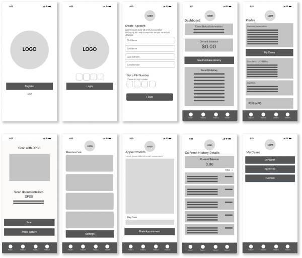
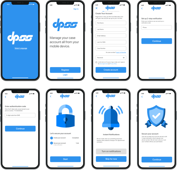
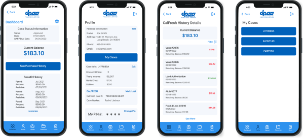
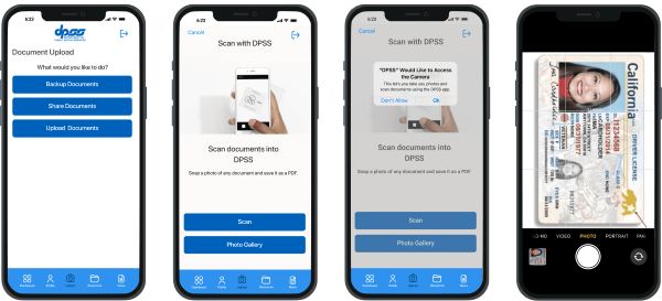
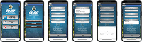
I started the process by creating wireframes. After they were finalized, I created 28 high-fidelity screens in Figma that modernized the app’s look and functionality. The redesign focused on visual clarity, accessibility, and streamlined workflows.
Key Features
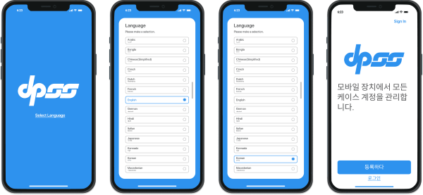
Modern Onboarding: Simplified registration and login process
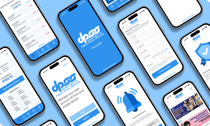
Dashboard: Real-time case status, balance info, purchase & benefit history
Profile Page: Editable personal info, plus "My Cases" section for multi-case users
Case Management: Switch between CalFresh, CalWORKs, and SNAP
SNAP Card Functionality: View card details, report as lost, request replacement
Multilingual Support: Language selector for non-English speakers
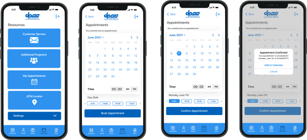
Appointment Scheduling: Book appointments directly in-app
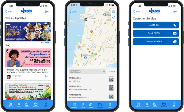
Resource Hub: Contact support, explore additional programs, find ATMs
News & Events: Stay informed with periodic updates
Bottom Navigation Bar: Five icons for easy access: Dashboard, Profile, Upload, Resources, News
Tools & Technology
Figma for prototyping and screen design
A/B testing with users for usability validation
Apple design language for visual inspiration and UX consistency
Results
Positive feedback from testers on ease of use and visual appeal
Streamlined experience reduced cognitive load and navigation time
Increased awareness of features like appointments and benefit history
Reflection
This project sharpened my UI/UX design skills and deepened my understanding of accessibility and user-centered design. If given the opportunity, I would collaborate with developers and policy stakeholders to turn this prototype into a working product that could positively impact the lives of many.
Next Steps